Showing posts with label Harry Crotty. Show all posts
Showing posts with label Harry Crotty. Show all posts
Friday, 25 April 2014

Thursday, 24 April 2014
Kitchen Sink
Kitchen Sink - A term which can have multiple interpretations - we read in to be a metaphor to explain the typical conventions of a Social Realism film. The sink being the pristine visible representation to cover up the dirty, grimy scene which actually occurs underneath.
We believe we followed this conception within our story line - giving an insight into what actually might occur for young unprivileged and misfortunate people and family's in todays society.
We believe we followed this conception within our story line - giving an insight into what actually might occur for young unprivileged and misfortunate people and family's in todays society.
Iconic Sounds implemented into our Trailer
Within post production we looked at adding accompanying sounds to layer into our trailer in order to compliment certain shots and scenes.
The two sounds we felt we could use were the sound of a train passing by at the very beginning of our trailer. In addition, near the end, when the state of equilibrium becomes unsettled, we added a police siren to help represent the connotations of danger and give reason for the characters state of vulnerability and discomfort.
we used a sounds similar to the ones below:
Narrative Theory
In order for our trailer to feel believable and conventional we followed the guidelines that theorists use to explain a narrative.
A few Theories that I believe we have either conformed to are:
Todorov's theory of Narrative - He believed that all conventional narratives are structured in five stages:
- A state of equilibrium at the outset.
- A disruption of the equilibrium by some action
- A recognition that there has been a disruption
- An attempt to repair the disruption
- A reinstatement of the equilibrium
This type of narrative structure is a universally implemented framework for many film narratives. Out trailer would mostly conform to this structure however would differ from the general structure in order to create the difficulties and exponential life problems our character faces throughout.
Propp's theory of Narrative - Vladimir Propp studied and critiqued Russian Folks tales. He identified a theory about characters and their actions - He said the typical characters found were:
- The Hero - as character that seeks something
- The villain - who opposes or actively blocks the hero's quest.
- The Donor - who provides an object with "magical" properties
- The Dispatcher - who sends the Hero on his/her quest via a message
- The False Hero - who disrupts the Hero's success by making false claims
- The Helper - who aids the Hero
- The Princess - acts as the reward for the Hero and the object of the Villain's plots
- Her Father - who acts to reward the Hero for his efforts
Most of the characters displayed here can be applied to those within our trailer. The examples may be slightly tenuous however can share the same attributes. for example:
- The Guitar that enables our character to earn her money could be the prop that descends from Propp' character - The Donor
- In our case, Propp's Princess who is saved by the Hero, our main character, is her ill father
Final Poster

This is our final poster for our film trailer 'In Headlights'. This is an evolved version of Poster Idea 1 and 4. Overall, we felt this was the most effective poster because of its aesthetic presentation and link to the conclusive promotional package (e.g. Website). Below is a diagram displaying the evolving process of creating our poster.

Poster Idea - Illustration (cont.)

Above is our final poster representing our illustration idea. Overall we are pleased with the result and below is a more detailed display of the different elements that brought it together. However, we have decided not to use it our final poster because it does not correspond with the website and lacks any clear relation to our trailer. Furthermore, because of its illustrative style it is a stark contrast to the live-action style, our trailer depicts.

- Firstly we inserted a misty/foggy London image onto a black background on Photoshop

2. We then faded the image to opacity 10%, this would provide depth to our poster

3.Added was a smaller, illustrated cityscape that was created using the final shot of our trailer as a template and an added glow effect to give the lights a rougher, illustrated style.

4.The illustrated deer was cropped so only the head and neck remained, we decided to d o this because it suited the poster compositionally aswell as providing a more visually impacting display.


Monday, 7 April 2014
Sunday, 30 March 2014
Monday, 17 March 2014
Poster Idea - Illustration

We were inspired by TYRANNOSAUR's unique illustrated poster design. The visual metaphor in its poster evokes a poignant motif. The image enforces the titles possible connotations. My initial interpretation of the poster is that the T - Rex under the ground denotes another more dangerous side to the small insignificant, in terms of scale within the poster, man holding ta bunch of roses in the foreground.

Myself and Oliver knew that the idea of a Deer in the headlights was a great metaphor for our trailers story. A girl, out of her comfort zone, stuck in the very apparent series of events which will determine her fate. We also felt that for the background of this potential trailer, a city road could help reiterate the Deer ( being our character ) out of her comfort zone.
Poster Idea 4

I wanted to use a still from this particular shot due to its ability to express the motion of the character. Naturally being a Close Up shot, it enables the viewer to share the experience with the girl. Within one frame this poster captures a binary opposition that would feature in the film - Country vs City.
I featured both the original scenic landscape in the background of the shot however in addition i placed a still from another shot taken looking out from the train. This shot, featuring the more industrial scenery of our characters journey, captures a sunset; adding to our trailers artistic feel and mentality. This could also serve to give insight into the story of our character - going up in the evening - to earn the money her family in the most unfortunate of circumstances.
Monday, 10 March 2014
Poster Research
We researched and analysed a variety of social realism film posters, looking into such elements as font, colours, etc.


Friday, 21 February 2014




Monday, 17 February 2014
Production Logo Ideas
In developing our production logo, we have aimed to link visual elements to the wording of our company, Drift Films.
Research into movie logo openings...
From this research we have been inspired by the following logos...
- Jerry Buckheimer Films
- 1492 Picture
- Summit Pictures
- Focus Features International
These logos all have a simplistic style that creates a professional look,We have decided to use the technique of 'time lapse' for logo opening, an idea taken from the 'Jerry Buckheimer Films' logo. Although this was originally going to be implemented into our trailer, we felt that it would not appeal to the stye we have created and look out of place.
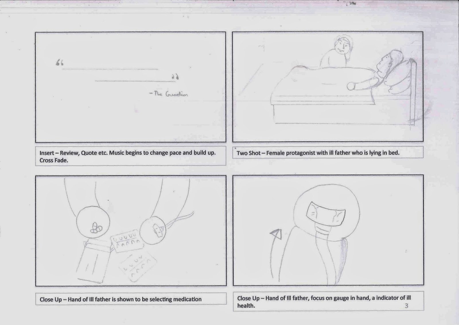
Below is a draft storybord of our logo opening...

Thursday, 13 February 2014
Laura Mulvey - 'Male Gaze' Theory

Laura Mulvey is a British feminist film theorist, best known for her essay, Visual Pleasure and Narrative Cinema in which she coined the term 'Male Gaze'. This term applies to her theory that in film the audience have to 'view' characters from the perspective of a heterosexual male.
In relation to our teaser trailer, this theory can be applied to our portrayal of prostitution. Below are some screenshots that, through miss-en-scene, verge to this theory.

In this shot we have conformed to Mulveys 'Male Gaze' theory, the lips suggest an heightened exposure of femininity, along with the Red colour being symbolic of lust, passion and danger.

The revealing costume worn by the female protagonist in this shot, can be perceived through Mulveys theory as addressing the character as a 'slut, slapper, whore, tart'.
Thursday, 6 February 2014
Music / Soundtrack
This is the piece of music we have selected to use in our Teaser Trailer. We have chosen it because it provides an appropriate atmosphere for our trailers narrative and setting. The opening piano melody provides a captivating and emotive introduction, an element that we want to replicate in our trailer. In relation to our narrative it means the melancholic aspects of our protagonists narrative can be depicted to the audience with more depth.
Thursday, 30 January 2014
Actors Brief
Here is a copy of the brief we gave to our actress so she could get an idea of what character we are trying to portray.

PLOT
A teenage girl goes to London as a way to earn money for her ill dad. As London life gets tough she resorts to tougher ways of earning money
1st COSTUME
Jeans
Boots/trainers
Layers (Hoodie, Coat, Scarfs, Hat)
Gloves
2nd COSTUME
Less layers, revealing
MAKE UP
For 1st costume: as little as possible, hair in ponytail
For 2nd costume: opposite, bring makeup, lipstick, mascara
Here is a screen shot from our trailers first draft with her in costume. It is a simple shot of her walking around London soon after she arrives.
Monday, 20 January 2014
Filming Schedule
Thursday 6th February - Father and daughter scenes.
- drive to location (house in Bromley with stair lift and other object that signify illness)
Shots - man on stair lift form above, below, sides, narrow depth of field shots.
Drip - we have been able to get a drip to use in some shots. these will include having the drip taped to the fathers hand, hanging the drip near the bed while he is 'sleeping' and also holding the drip near the camera and having the father in the background. We will need to make sure it is obvious that the drip is on the father and that the girl is also in some shots so that the audience will se the connection between the two settings we will use.

Monday 3rd February / Location: London
13.20
- Train from Tonbridge to Charing Cross
14.03
- Arrive in London
- Begin Slow-Mo Tracking Shot from Train
- Walk to Westminister Bridge whilst filming
- Finish TS at Westminster Bridge
- Begin Time Lapse at 4 More London
15.00(Approx.)
- St. James Park
16.00(Approx.)
- Trafalgar Square
17.00(Approx.)
- Piccadilly Circus

Sunday 26th January - Kyla
London Filming
- Get off tube at charring cross film follow shot.
- Walk along river bank to Westminster bridge.
- Walk across Westminster bridge filming from all angles of Kyla,
- go to Trafalgar square
film tracking shots, close ups, London in distance, any arty shots of scenery.

Thursday, 19 December 2013
Time-Lapse research
This National Geographic Time-Lapse is a professional example of Time-Lapse photography.
The duration time of a Time-Lapse can vary from a few seconds to several months.
For example, a time lapse could consists of a photograph every 30 seconds for an hour. The end result being something like this:
The time lapse will be a key feature to our Trailer. Its features fuelled the ideas of how we want to shoot our footage. Taking advantage of the compositions that can be diversified, enabling the artistic feel we want, in the streets of London.
Useful Guides:
- http://www.learntimelapse.com/time-lapse-photography-how-to-guide/
- http://www.youtube.com/watch?v=DPeEZn0_ezs
Wednesday, 18 December 2013
Certificate Ratings

The BBFC (British Board Of Education) are the people behind classifying the ratings of the films we watch.
Every 4-5 years, the BBFC carries out a major public consultation exercise to find out what the public thinks about the age rating of films and videos before they are released and whether the BBFC’s classification standards meet public concerns.
The main issues that are addressed when allocating a film (for example) are :
- Discrimination -Potentially offensive content, relating to such matters as race, gender, religion, disability or sexuality.
- Drugs -No work taken as a whole may promote the misuse of drugs and any detailed portrayal of drug misuse likely to promote or glamorise the activity may be cut.
- Horror -The use of frightening elements which might scare or unsettle an audience is part of a long tradition of story telling and film making.
- Language -Many people are offended, some of them deeply, by bad language. This may include the use of expletives with a sexual, religious or racial association, offensive language about minority groups and commonly understood rude gestures.
- Imitable behaviour -Classification decisions will take into account any detailed portrayal of criminal and violent techniques, and any glamorisation of easily accessible weapons, such as knives.
- Nudity -Natural nudity with no sexual context is acceptable at all classification levels, but will not occur more than occasionally in the lowest category.
- Theme -Classification decisions will take into account the theme of a work, but will depend significantly on the treatment of that theme, and especially the sensitivity of its presentation.
- Sex -The portrayal of sexual activity can range from kissing and verbal references to ‘making love’, to detail of real sex. This is reflected in the classification system, in which progressively stronger portrayals are allowed as the categories rise.
- Violence -Violence has always been a feature of entertainment for children and adults. Classification decisions will take account of the degree and nature of any violence in a work.
Subscribe to:
Posts (Atom)